...that the Hawkeye Initiative is one of the absolute greatest things ever.
Once finals are done, I really want to submit something to it.
For those who don't know, the Hawkeye Initiative essentially brings light to the objectification of female characters in the comic book industry. People take the outrageous poses women are put into, and then (usually) apply them to Hawkeye.
This is an absolutely fantastic example of the Hawkeye Initiative.
Tuesday, December 4, 2012
Thursday, November 29, 2012
Rotoscope gif (after page break)
For my Moving Images class, we had to do a quick rotoscope of this couple. They were dancing to some sort of incredibly annoying song.
For mine, I just rotoscoped the girl.
It's a little over a second long, so I turned it into a gif so it can be viewed however long you want without having to press "play" again.
I'm putting it under the page break, because it features a lot of fast-moving lines and changing colours, and is therefore potentially dangerous to people with epilepsy.
Monday, November 5, 2012
Actually...
Actually, it may not be blogger this time.
It might be the fact it's an mp4.
Either I'm going crazy, or the mp4 file is a little less synced than the mov.
So, here is the same animation from before in both .mov and .mp4 formats.
Please tell me that someone else sees the audio as starting later in the mp4.
.mov:
.mp4:
It might be the fact it's an mp4.
Either I'm going crazy, or the mp4 file is a little less synced than the mov.
So, here is the same animation from before in both .mov and .mp4 formats.
Please tell me that someone else sees the audio as starting later in the mp4.
.mov:
.mp4:
Lip Sync Animation
Originally, he was going to swat away a creature I never made. When I got to the lab, I realized my paper wasn't set up to the orientation of the camera, so I worked with it. Instead of scrapping everything and starting over, I made it look like my gaffe was completely deliberate. I like it better this way, though. I feel like it's more dynamic.
And this time the video is an mp4, so if it doesn't work, it's Blogger.
I'd rather not have to go to youtube if I don't have to.
EDIT
So yeah, it's blogger. When I run the video without it being on blogger, the audio is still slightly out of sink, but not as crazily as it is here. Does anyone else have these issues with blogger?
Thursday, November 1, 2012
Another WIP of that viking guy

So I worked a little more on this charming fellow. He's gonna have stubble at the very least once I've gotten him all filled in.
Those random white bits floating above the skull side will make more sense once I start actively working on that side. I'm avoiding it like the plague, however, because I'm not entirely sure how to tackle it just yet. However, I will get there.
I'm happy with it so far, but I'm sorely regretting my lack of white charcoal pencils. I'm trying to make the two I have last.
I WILL make the two I have last.
Sorry for the lousy cell phone picture again!
Sunday, October 21, 2012
Cut-out Animation.
I realized I used exclamation points in quite a few of my titles, so I decided I needed to tone it down a little with the excitement.
Not everything is that exciting.
So here is a cutout animation I had to do for homework. The materials used were thick, black construction paper and that blue tacky stuff you use to stick things up on the wall. I used the tacky stuff instead of string so I could do that thing I did at the end without having to create an entirely new arm.
This, for whatever reason, doesn't play from the beginning. The actual thing is about 21 seconds long, but this is only 14 seconds. The only thing you're missing is her walking in and sniffing the flower.
I'm convinced now that the issue is some sort of mis-communication between blogger and quicktime. I'm gonna experiment with that.
If I could have changed anything, I would have made her "AHH!" arms go a little faster, because right now they kinda look more like a hold up than her being scared. Also, I would've made the monster a little more movable.
Saturday, October 20, 2012
My Muse #2
.I feel like it's time for another installment of "My Muse".
I wanted to save this one until a later date, but I'm on a kick right now and want to talk about it. Anyone more knowledgeable than me is more than welcome to jump in and correct me or whatever.
Today's muse is:
 |
| Self portrait (1623) |
Gian Lorenzo Bernini (1598 - 1680), 17th-century Italian sculptor.
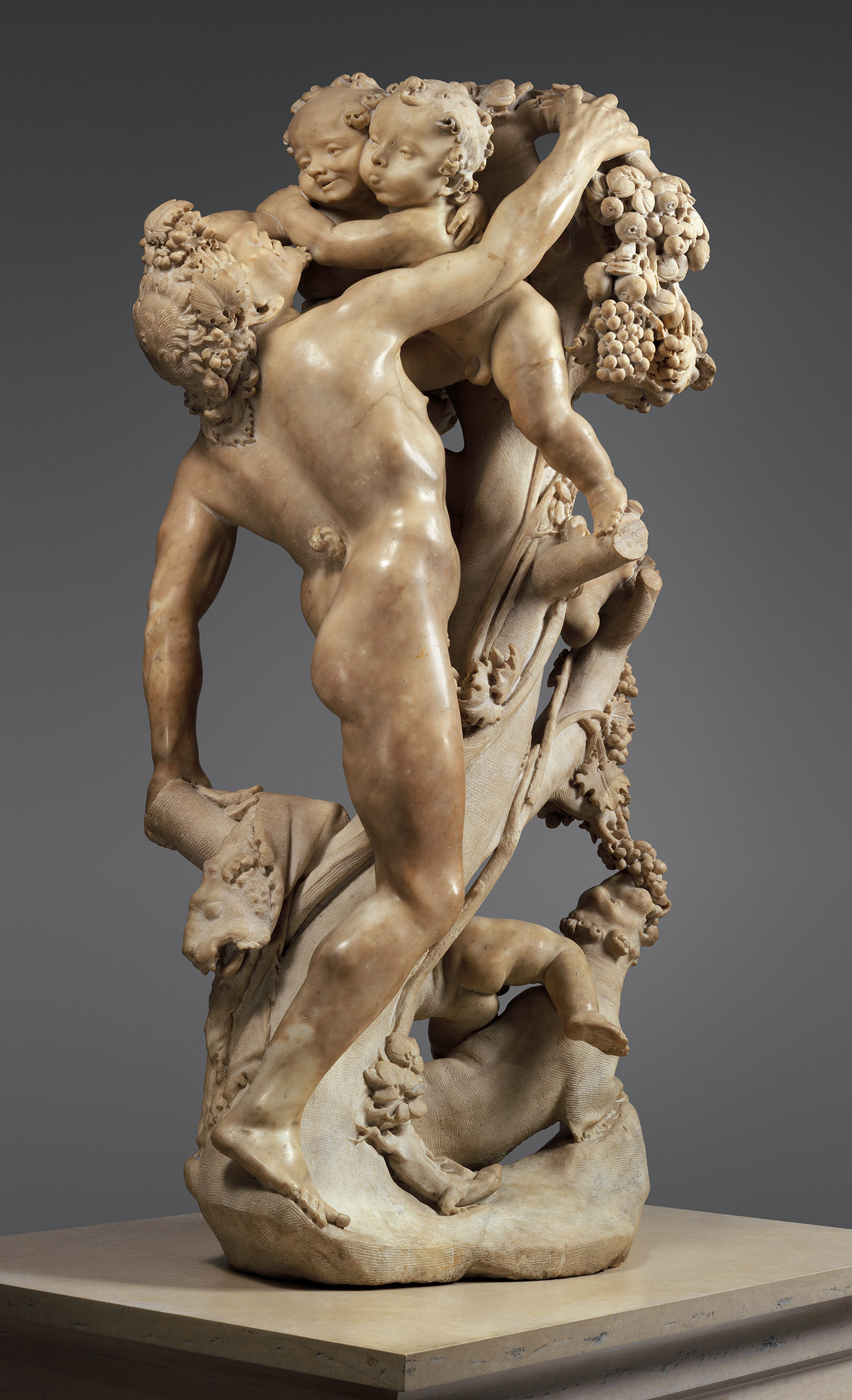 |
| A Faun Teased by Children (1616-17) Attributed to both Pietro and Lorenzo |
Bernini was born on December 7th, 1598 in Naples, Italy. His father, Pietro Bernini, was also a sculptor. He never quite reached the same fame as his son, but he was still incredibly talented. As much as he may have denied it, Lorenzo learned a great deal from his father. Also, a lot of his collabourations with his father were more like "Here, now you try!" sorts of things until Lorenzo got the hang of it.
Since I'm not going to be talking about Pietro anymore, I'm going to go back to calling Lorenzo "Bernini".

 |
| Bust of Cardinal Richelieu (1641) |
Bernini spent pretty much all of his adult life living in Rome, which is where you'll find most of his works. I believe he only ever left Rome once in his life, and that was to go to France in order to do a portrait bust of King Louis XIV. He really never had any desire to leave Rome, and would often require international patrons to send him portraits so that he could do the portrait bust in Rome, and then send it on out to whatever non-Roman destination it needed to reach.
As a person, Bernini was...interesting. He had what's known as a choleric temperament. For those who don't know what that means (like me pre-google), it's basically means that he was very energetic, liked to give orders, and was generally kind of high maintenance. He had a sizable sweet tooth, and he also really liked fruit. The biography I read on him really stressed his love of fruit.
So you don't understand just how much this man loved fruit.
So you don't understand just how much this man loved fruit.
Apparently Bernini also suffered from chronic migraines. That's the exact thing you want to have when you're a sculptor working in a loud studio with glorious sunshine reflecting off the bright, white marble. He apparently had a bit of a temper on him. I can't, for the life of me, figure out why this man would have a short fuse. Just give the poor thing an Excedrin and an apple. However, since such miraculous drugs didn't exist back in Bernini's time, I feel like his next hobby probably helped him with those migraines:
He had a healthy libido.
He had a healthy libido.
 |
| Bust of Costanza Bonarelli (1636-37) |
His most famous lover was a woman by the name of Costanza Bonarelli. She even got her own portrait bust, which remained in the Bernini household long after their fling came to a (bloody) end. Costanza was the wife of one of the workers in Bernini's work shop. So really, Bernini had no business sleeping with her. Neither did Luigi, his brother, which is how the entire thing came to an end. When Bernini found out those two were sleeping together, he took that "I'M GOING TO KILL YOU." thing siblings typically do a little too seriously and almost killed his brother. Costanza's face got slashed as was apparently not too out of the norm for adulterous women...? The pope had enough of the nonsense and forced Bernini to grow up and get married.
Now, aside from the general public, Bernini had a rival. Borromini was an architect at the time, also competing for work in Rome. Normally, sculptors and architects don't really cross paths too often. However, Bernini didn't just sculpt (he dabbled in architecture amongst other things), and therefore was competition for Borromini. It wasn't the sort of rivalry where they'd duke it out in the middle of Rome, but they certainly took their turns taking shots at one another.
 |
| "The Ecstasy of St. Theresa" (1647-52) ...I mean, just look at how crappy it is. |
Bernini also had a habit of being super critical of his own work. In response to what is probably one of his most famous pieces, "The Ecstasy of St. Teresa", he regarded it as the "least bad" work he'd done.
Least bad.
Not "this is good."
Least.
Bad.
Because it wasn't complete crap, but it was still crap.
Hopefully I didn't lose anyone there with my sarcasm.
It's getting to be much later than I thought it was, so I'm going to round up this post. I belive, just by looking at the few things I showed you, why he's one of my muses.
Even though I'm not entirely sure how well I'd get along with him as a person, I still really admire his talent and the hard work he put into making all these things.
He's just absolutely ridiculous and I'm obsessed.
I could honestly gush for days, which is why I was kind of sparse on the images. There are just far too many good ones to choose from.
Thursday, October 18, 2012
Rotoscope!
So as I was perusing my computer, looking for nifty things to show you guys so you don't think this blog is dead, I discovered this rotoscope from last semester!
I know. Everything is "last semester". Not for long.
Anyway, the scene is from "White Christmas". No matter what I do to try to fix it, the audio always cuts out at the end. I've settled on blaming quicktime and shaking an angry fist at it. The word it cuts off is "sisters".
Hopefully blogger is kinder to the quality than another website was. I tried to upload it, but the quality was absolutely terrible.
So if the quality of this is awful, as in, it's all blurry and crap, I don't know what that is. It looks lovely when I play it in quicktime and it looked lovely when I played it for the class.
Which was also in quicktime, actually.
I feel like there's just something about quicktime...
The messiness of the colouring and stuff was a style choice.
EDIT:
Upon uploading two different versions of this, I have come to terms with the fact I need to save it as something other than an .mov and hope it looks better. For now, though, it's gonna look like this. Once I've figured out how to make it look better, I'll upload a better quality video.
Friday, October 12, 2012
A personal project!
The other night, I suddenly found myself really inspired to draw a viking.
He's not incredibly historically accurate.
As a line drawing, he actually really reminded me of St. John the Baptist, so I've been calling him "Johnny".
St. John the Viking.
He's not done yet, but I do have some progress shots (excuse my cell phone-quality images):


He's not incredibly historically accurate.
As a line drawing, he actually really reminded me of St. John the Baptist, so I've been calling him "Johnny".
St. John the Viking.
He's not done yet, but I do have some progress shots (excuse my cell phone-quality images):
I tend to jump around a lot when I work on things-- especially portraits or other fine arts pieces. I find that when I work on one specific area for too long, eventually it all just sorta...looks the same.
When he's completed and if I'm satisfied with him, I might get prints made so I can sell a few copies while keeping the original as a portfolio piece.
Friday, October 5, 2012
Fun with photos.
I am, in no way, a photographer.
However, I still enjoy having fun with photography. I had a couple of models who decided that sure, this would be a fun way to spend a Friday night.
I'm still getting used to this camera. It's (possibly obviously) not a DSLR and really seems to prefer outdoor, sunny weather over everything else. But that's why I'm still learning my way around it: so I can make it do my bidding.
Anyway, we set up a makeshift "studio" in my apartment by pinning a bed sheet over a doorway, shutting off all the lights, and using a lantern as a source of light. We did a few shots standing, then I brought out a stool and I found that the photos became less blurry.
I ran the photos through photoshop.
Unfortunately, my camera was still set on super small photos from when I did the gifs, so half of the photos are small (640 x 480). I caught the error and was able to make the other model's photos larger. I offered to reshoot the small photos, but she didn't mind.
So, without further ado, the photos:


Would it surprise anyone to find out I adore baroque art?
For those who don't get it: It's the lighting.
I really like dramatic, high-contrast lighting.
I really like dramatic, high-contrast lighting.
Tuesday, October 2, 2012
Figure Drawing (NSFW)
Every Tuesday, my school hosts a free figure drawing class. Tonight, as per professor's assignment, I went.
I haven't had a figure drawing course in years (I transferred universities), so it was really awkward getting back into the swing of things. Showing you these drawings will reveal to you my greatest secret:


I haven't had a figure drawing course in years (I transferred universities), so it was really awkward getting back into the swing of things. Showing you these drawings will reveal to you my greatest secret:
Feet and hands are the bane of my existence.
I'll definitely do more studies in regards to those parts of the anatomy, however, and then everything will be copacetic. I'd also like to go to these figure drawing sessions more often, but that's entirely dependent on my schedule.
Anyway, here we go!
First, five 2-minute poses:
Anyway, here we go!
First, five 2-minute poses:
 |
 |
| Okay, so this one I completely botched. I have no idea what my issue was. |


Then came the two 5-minute poses:

 |
| She's looking down, and the stool was actually behind her. I probably should have put more environment into this one. |
Finally, two 10-minute poses:

 |
| STUPID, STUPID HEATER THING. |
Friday, September 28, 2012
The Great Art-Dump Post!
I figured it'd be fun to show you guys some of my past and present works. Anything present being things that I'm not doing specifically for a class, and past works being literally anything from the past.
Maybe one of these days I'll show you the horrors of my early childhood sketchbook.
...But then again, maybe not. The point of this is to get people to look at my work, not scare them away.
I was a frightening child.
So, anyway, here we go!:
 Now this is, I think, a pretty recognizable photo. If not, then here is the reference for you. This was originally done as a line drawing, but I got super into it and therefore super carried away. My professor loved it, though.
This is from...2009?
I used an HB, 4B, 6B, and 8B pencil on sketchbook paper.
 This was done at a friend's request. I couldn't think of anything to draw, so she eagerly sugested a shark vs. squid battle. This was going to get a lovely makeover in illustrator, but I never got around to it. Maybe one of these days I'll find the time, but I have a ton of other works that need to get finished before I can visit this one again. Sadly.
2011.
Just your standard mechanical pencil on sketchbook paper.

This was part of a much larger project. These guys are maybe 9 inches long at the absolute biggest, the greater portion of this project dedicated to a very desolate environment. I don't have a photo of the full thing, because it's the size of a standard poster and it was given away to a firefighter as a gift.
This was a school project in which I had to make a poster for the word "sustainability". Everyone else did something related to the environment, but I wanted to do something with firefighters since they were the first things I thought of. My professor told me that it most likely wouldn't work, and that I would be better off just doing something eco-friendly. Instead, I made the guidelines for the project work to my idea. I went back to my dorm and found this definition for sustain:
to undergo, experience, or suffer (injury, loss, etc.); endure without giving way or yielding.
Just tacked a "the ability to" to the front of that, and BAM! Sustainability. My professor was thrilled and so was I.
2009. These guys in particular were bristol board, acrylic paint, and technical pen. Here's the reference.
 I debated putting this piece up because it's really old, but it's still nice.
This was done during one of my fine arts classes back in...2007?
Since it was a drawing from life, I don't have a reference photo. Though if you find a photo of a handkerchief pinned exactly like this, please let me know so I can let my art teacher know we're both secretly psychic.
Charcoal pencils on charcoal paper.
 Look! Colour! This is a portrait I did for someone after their childhood pet had died. I'm using this photo, because it also includes the reference photo. Also, I don't have any other photos of this portrait.
This was charcoal pastels on charcoal paper. It also dates back to about 2010.
CIRCA 2010.
 This is also super old, but everyone really seems to enjoy it, so here it is. Pretty sure we all know this lovely character, but for those who don't, this is the Joker of Batman fame. Infamy? No, fame; he pretty much stole the movie. This is from 2008, and currently it's framed and hanging up. I've gotten a few offers on this, but it's not going anywhere.
If I could do this over, it'd look better.
Here is the reference. Now excuse me as I still refuse to get over how I straightened out his head.
Charcoal pastels and a playing card on charcoal paper.
 I don't know how into Norwegian Folk-Rock anyone else is, but I, for one, am totally for it.
Vote Charbot Labs 2012: We're All About the Norwegian Folk-Rock.
This was the product of a vicious Møkkaman earworm. I decided to draw out what I felt this Møkkaman would look like had I any say in the character design. In his hand, he would be holding a flute of some sort.
I'm aware of how ridiculous the wrinkles in his sleeve are. It looks like an accordion.
2011.
Sorry about the obnoxious contrast; I sketched it out fairly lightly and had to up the contrast in order for it to be visible.
Mechanical pencil on sketchbook paper.
 This was me just sorta...screwing around in Photoshop. I took an old character of mine named Stu the Emo Kid, and I gave him a makeover. Now he's older and a hipster.
It started as a sketch, by the way. I didn't draw the entire thing out in Photoshop.
I feel like you should be able to see his other hand, but right hands are so over-rated.
Too mainstream for Stu.
This is also 2011.
Mechanical pencil on sketchbook paper, then a vicious bludgeoning in PS CS5.
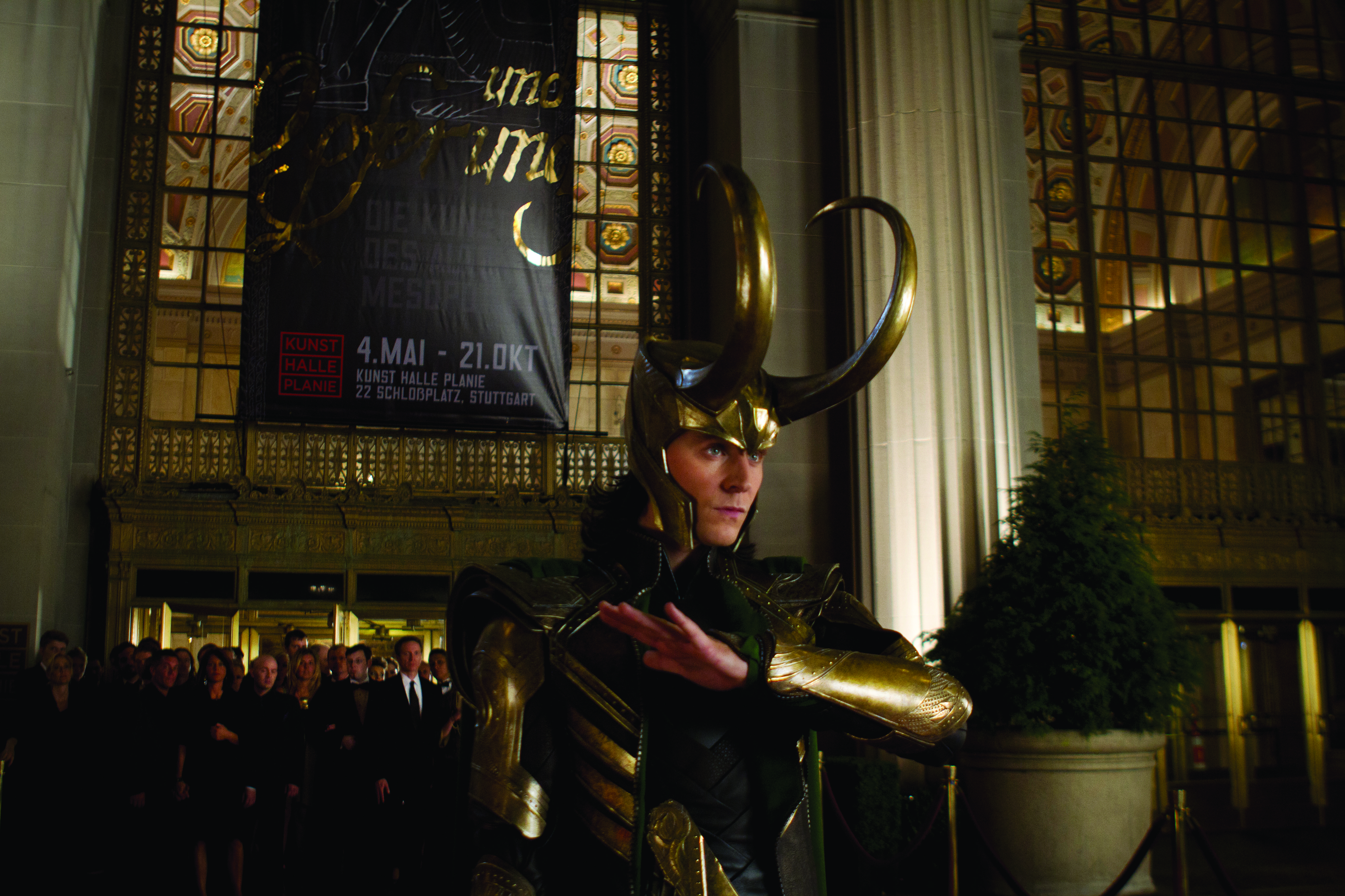
 This is a current project. I've never done a digital project, so I have absolutely no idea what I'm doing. I'm also not going for that absolutely beautiful and amazing photo-realistic portrait look, either, because I was never really into that. I wish I was.
Loki's nose makes me very sad and I'm dreading the day I need to work on it again to make it more...not weird-looking. Everything else I don't mind fixing.
It's just that nose.
And no, his eyebrow isn't monstrously long--part of that is his helmet's shadow. That would be really amusing, though. "I am Loki of Asgard, and I am burdened with glorious eyebrow."
2012.
Here is the reference photo!
 Last but not least, here's a gif of the WIP of a rotoscope I'm currently working on. I want to say what these guys are being rotoscoped to, but I don't want to give away the surprise.
So unless I get yelled at because of copyright issues, it's staying a secret.
For those who don't know, this is (l - r): Iron Man, Captain America, and Phil Coulson.
I just love Iron Man in this gif.
2012.
And there you have it, folks! Some of my past and current projects that aren't necessarily school-related. As long as the photo quality was decent enough, I could find the reference photo when applicable, and it wasn't too old, it's here.
Maybe one of these days I'll show you the horrors of my early childhood sketchbook.
...But then again, maybe not. The point of this is to get people to look at my work, not scare them away.
I was a frightening child.
So, anyway, here we go!:

This is from...2009?
I used an HB, 4B, 6B, and 8B pencil on sketchbook paper.

2011.
Just your standard mechanical pencil on sketchbook paper.

This was part of a much larger project. These guys are maybe 9 inches long at the absolute biggest, the greater portion of this project dedicated to a very desolate environment. I don't have a photo of the full thing, because it's the size of a standard poster and it was given away to a firefighter as a gift.
This was a school project in which I had to make a poster for the word "sustainability". Everyone else did something related to the environment, but I wanted to do something with firefighters since they were the first things I thought of. My professor told me that it most likely wouldn't work, and that I would be better off just doing something eco-friendly. Instead, I made the guidelines for the project work to my idea. I went back to my dorm and found this definition for sustain:
to undergo, experience, or suffer (injury, loss, etc.); endure without giving way or yielding.
Just tacked a "the ability to" to the front of that, and BAM! Sustainability. My professor was thrilled and so was I.
2009. These guys in particular were bristol board, acrylic paint, and technical pen. Here's the reference.

This was done during one of my fine arts classes back in...2007?
Since it was a drawing from life, I don't have a reference photo. Though if you find a photo of a handkerchief pinned exactly like this, please let me know so I can let my art teacher know we're both secretly psychic.
Charcoal pencils on charcoal paper.

This was charcoal pastels on charcoal paper. It also dates back to about 2010.
CIRCA 2010.

If I could do this over, it'd look better.
Here is the reference. Now excuse me as I still refuse to get over how I straightened out his head.
Charcoal pastels and a playing card on charcoal paper.

Vote Charbot Labs 2012: We're All About the Norwegian Folk-Rock.
This was the product of a vicious Møkkaman earworm. I decided to draw out what I felt this Møkkaman would look like had I any say in the character design. In his hand, he would be holding a flute of some sort.
I'm aware of how ridiculous the wrinkles in his sleeve are. It looks like an accordion.
2011.
Sorry about the obnoxious contrast; I sketched it out fairly lightly and had to up the contrast in order for it to be visible.
Mechanical pencil on sketchbook paper.

It started as a sketch, by the way. I didn't draw the entire thing out in Photoshop.
I feel like you should be able to see his other hand, but right hands are so over-rated.
Too mainstream for Stu.
This is also 2011.
Mechanical pencil on sketchbook paper, then a vicious bludgeoning in PS CS5.

Loki's nose makes me very sad and I'm dreading the day I need to work on it again to make it more...not weird-looking. Everything else I don't mind fixing.
It's just that nose.
And no, his eyebrow isn't monstrously long--part of that is his helmet's shadow. That would be really amusing, though. "I am Loki of Asgard, and I am burdened with glorious eyebrow."
2012.
Here is the reference photo!

So unless I get yelled at because of copyright issues, it's staying a secret.
For those who don't know, this is (l - r): Iron Man, Captain America, and Phil Coulson.
I just love Iron Man in this gif.
2012.
And there you have it, folks! Some of my past and current projects that aren't necessarily school-related. As long as the photo quality was decent enough, I could find the reference photo when applicable, and it wasn't too old, it's here.
Sunday, September 23, 2012
Some character studies

Sorry about the lame photo; I'm currently without a scanner. Once I get my scanner back, I'll get a better image up.
So here's what I spent last night working on. It's a superhero character of mine whose story and all that is still in the works. I wanted to play around with inking a little, but since I'm still not entirely sure on what his costume colours would be, I recognize it's difficult to read those random, thin lines as a pattern.
I've never really drawn muscular men before, so I used references. I'm really glad I did, because I'm definitely learning much more than I would by guessing what this particular body type should look like.
...though I think the men I used as references have two sliiightly different builds.
Either way, I'm satisfied with how these turned out.
Here is the reference for the top.
Here is the reference for the bottom.
Oh.
I suppose I should send a shout out to Lithuania for being the main source of my page views.
Thank you, Lithuania!
Thank you, Lithuania!
Tuesday, September 18, 2012
My muse #1
I had previously stated that I was going to use this blog to also discuss things from which I derived inspiration. For this entry, I would like to discuss Victorian Post-Mortem photography.
So first, let me apologize to anyone out there doing research on the subject who happened to come across my blog because I happened to show up when you googled "post-mortem photography". I'm not a good, scholarly source. I'll try to work on that for you.

I feel like it would be very...astute of me to say "Victorian post-mortem photography was popular during the Victorian era". To get by that, I pointed out how astute it would be to make such a mundane statement. Anyway, photography was still a relatively new technology with a considerably longer exposure time than what most people use today. Due to the slow nature of photography, people had to stand as still as possible for X-amount of time in order to ensure that they weren't blurry. The best way to make sure your subject appears completely in focus in a photo?
Take a photo of them when they're dead.
On the more sentimental side of things, post-mortem photography was sometimes the only photo families would have of a particular family member since photography was also rather expensive. It was considered a very respectful way to commemorate the dead, and much like how a lot of modern households will plaster baby photos all over the place, it wasn't uncommon to see these photos on display in the household.
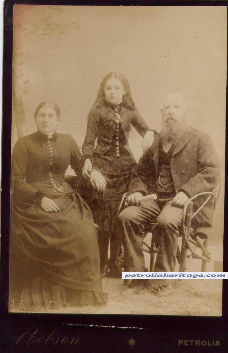
Now, there were a few ways people went about portraying their loved ones. Sometimes the loved one was posed in a way that made it appear as though they were still alive (like the guy above). When standing, those bodies, like the guy above, were usually propped up with a stand that would wrap around their waist and neck in order to make sure they didn't topple over. You can actually see the stand behind the man's left (stage left) foot. Additionally, stiff wires would be run along the arms in order to keep them in place.

Sometimes the loved one was posed with the rest of their family. When put in this situation, as you can see, something looks a little off. The man in the centre is just a little too stiff.
In some cases, eyes were painted onto the eyelids in order to give a more "life-like" (eerie?) appearance:
You can see the stand behind this young lady, too.
Sometimes, photos were taken which showed that the loved one was quite clearly passed. These photos would range from being very simple:


...to some truly beautiful things:


I realize most of these photos depict people standing. I feel like I should point out that's more of a coincidence; there wasn't any rule dictating the person had to be standing. They could be sitting or laying down, too. Whatever the family wanted, really.
Sometimes, the contrast between the living and the dead made for some amazing photos:

It just shows how much living beings actually move, even when standing "perfectly still". It doesn't get much stiller than death.
I have a fascination with dark imagery, so this appeals to me. I admire this practice, and I feel like it's a shame that this went out of fashion. It's a very lovely way to honour the dead, and I feel like it possibly helped ease the pain of losing a loved one. Photography wasn't as easily affordable back then, so what a lovely way to express your love for the recently deceased.
So first, let me apologize to anyone out there doing research on the subject who happened to come across my blog because I happened to show up when you googled "post-mortem photography". I'm not a good, scholarly source. I'll try to work on that for you.
I feel like it would be very...astute of me to say "Victorian post-mortem photography was popular during the Victorian era". To get by that, I pointed out how astute it would be to make such a mundane statement. Anyway, photography was still a relatively new technology with a considerably longer exposure time than what most people use today. Due to the slow nature of photography, people had to stand as still as possible for X-amount of time in order to ensure that they weren't blurry. The best way to make sure your subject appears completely in focus in a photo?
Take a photo of them when they're dead.
On the more sentimental side of things, post-mortem photography was sometimes the only photo families would have of a particular family member since photography was also rather expensive. It was considered a very respectful way to commemorate the dead, and much like how a lot of modern households will plaster baby photos all over the place, it wasn't uncommon to see these photos on display in the household.
Now, there were a few ways people went about portraying their loved ones. Sometimes the loved one was posed in a way that made it appear as though they were still alive (like the guy above). When standing, those bodies, like the guy above, were usually propped up with a stand that would wrap around their waist and neck in order to make sure they didn't topple over. You can actually see the stand behind the man's left (stage left) foot. Additionally, stiff wires would be run along the arms in order to keep them in place.
Sometimes the loved one was posed with the rest of their family. When put in this situation, as you can see, something looks a little off. The man in the centre is just a little too stiff.
In some cases, eyes were painted onto the eyelids in order to give a more "life-like" (eerie?) appearance:
You can see the stand behind this young lady, too.
Sometimes, photos were taken which showed that the loved one was quite clearly passed. These photos would range from being very simple:
...to some truly beautiful things:
I realize most of these photos depict people standing. I feel like I should point out that's more of a coincidence; there wasn't any rule dictating the person had to be standing. They could be sitting or laying down, too. Whatever the family wanted, really.
Sometimes, the contrast between the living and the dead made for some amazing photos:
It just shows how much living beings actually move, even when standing "perfectly still". It doesn't get much stiller than death.
I have a fascination with dark imagery, so this appeals to me. I admire this practice, and I feel like it's a shame that this went out of fashion. It's a very lovely way to honour the dead, and I feel like it possibly helped ease the pain of losing a loved one. Photography wasn't as easily affordable back then, so what a lovely way to express your love for the recently deceased.
Sunday, September 16, 2012
Pixelation!
So today I gathered some classmates and we sallied forth into the wild, blue yonder in order to do an art project.
And by "wild, blue yonder", I mean "random places in the city that wouldn't be heavily populated".
Same thing, right?
The idea was to create a gif of you (or someone else) exploring the city. We got a few successful ones, so I'm going to share those with you, my darling reader. Sorry if this freaks your computer out:


Monday, September 3, 2012
Getting started.
There's a few things I'd like to actually do on this blog outside of post my work.
For one, I'd like to actually work on its theme, but for now that's going to have to wait.
For one, I'd like to actually work on its theme, but for now that's going to have to wait.
My professor wants us, in class, to do this thing where we bring in a story about an artist who inspires us. We'd do this on a weekly basis, one at a time (as in, one student per week). I'd like to also do something similar to that here as well. I figure it'd be fun to show who I derive inspiration from, even if I don't reflect it in my artwork. The only thing I would change is that it wouldn't just be artist-specific; it'll be anyone/thing I find inspiring.
I don't feel like I have anything truly substantial to upload just yet, but I should by the end of the week.
In the meantime, I'll probably make text posts like this in order to help me get into the swing of regularly updating this.
Monday, August 27, 2012
Coming Soon...
My professor requested that we set up blogs in order to keep an archive of all our work in a way that could also work as a means of putting ourselves out there.
I'm currently doing this in between classes, so I don't quite have the time to actually set it up properly. Give me a few days and this will be all nice and shiny.
The trick will then be keeping up with it.
I'm currently doing this in between classes, so I don't quite have the time to actually set it up properly. Give me a few days and this will be all nice and shiny.
The trick will then be keeping up with it.
Subscribe to:
Posts (Atom)